Reusable alert dialog in Vue and React
6m read- Vue
- React
- Patterns
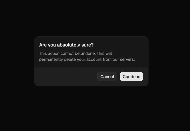
Every app eventually needs one of those “Are you sure?” dialogs. You click delete, and a little box pops up asking you to confirm. Simple enough, but if you’ve ever wired up that modal state by hand more than twice, you know how tedious it gets. A boolean to track visibility, a callback for confirm, another for cancel, and suddenly your component is drowning in dialog plumbing.
A better approach would be a Promise-based useAlert composable (Vue) or hook (React) that you can call like a regular async function. Call show(...), await the result, and get back true or false. No state management, no prop drilling, just a clean one-liner wherever you need confirmation.
The idea is simple. We create a single alert dialog component that lives at the root of our app. A shared piece of state holds the current dialog data and a resolve function. When you call useAlert().show(...), it sets that state and returns a Promise. The dialog appears, the user clicks OK or Cancel, and the Promise resolves. That’s it.
The focus of this post is entirely on the logic, not the styling. We’re using plain HTML and basic CSS here for clarity, but you could easily swap in any UI library (like Radix, Headless UI, shadcn/ui, etc.) for the modal itself and the underlying logic would stay exactly the same.
Below is the full implementation in both Vue and React.
File structure
src/├── components/│ ├── AlertDialog.vue│ └── SomeComponent.vue├── composables/│ └── useAlert.ts└── app.vueimport { ref } from "vue";
export type AlertDialogProps = { data: { title?: string; message: string; confirmText?: string; cancelText?: string; }; resolve: (value: boolean) => void;};
const current = ref<AlertDialogProps>();
const show = (data: AlertDialogProps["data"]): Promise<boolean> => { return new Promise((resolve) => { current.value = { data, resolve }; });};
export const useAlert = () => { return { current, show };};<script setup lang="ts">import { useAlert } from "@/composables/useAlert";
const { current } = useAlert();
const handleConfirm = () => { current.value?.resolve(true); current.value = undefined;};
const handleCancel = () => { current.value?.resolve(false); current.value = undefined;};</script>
<template> <div v-if="current !== undefined" class="dialog-backdrop"> <div class="dialog"> <h3 v-if="current.data.title">{{ current.data.title }}</h3> <p>{{ current.data.message }}</p> <div class="dialog-actions"> <button class="dialog-btn" @click="handleCancel"> {{ current.data.cancelText || "Cancel" }} </button> <button class="dialog-btn dialog-btn-primary" @click="handleConfirm"> {{ current.data.confirmText || "OK" }} </button> </div> </div> </div></template>
<style scoped>.dialog-backdrop { position: fixed; inset: 0; background: rgba(0, 0, 0, 0.4); display: flex; align-items: center; justify-content: center; z-index: 1000;}.dialog { background: #fff; border-radius: 8px; box-shadow: 0 2px 16px rgba(0, 0, 0, 0.2); padding: 2rem; min-width: 320px; max-width: 90vw;}.dialog-actions { display: flex; gap: 1rem; margin-top: 2rem; justify-content: flex-end;}.dialog-btn { padding: 0.5rem 1.5rem; border-radius: 4px; border: none; background: #eee; cursor: pointer; font-size: 1rem;}.dialog-btn-primary { background: #007bff; color: #fff;}</style><script setup lang="ts">import AlertDialog from "@/components/AlertDialog.vue";</script>
<template> <!-- Rest of your app --> <AlertDialog /></template><script setup lang="ts">import { useAlert } from "@/composables/useAlert";
const { show } = useAlert();
const handleDelete = async () => { const result = await show({ title: "Confirm Deletion", message: "Are you sure you want to delete this item?", confirmText: "Delete", cancelText: "Cancel", }); if (result) { // Perform deletion }};</script>
<template> <button @click="handleDelete">Delete Item</button></template>File structure
src/├── context/│ └── alert.tsx├── hooks/│ └── useAlert.ts├── providers/│ ├── AlertProvider.tsx│ └── AlertDialog.css├── app.tsx└── components/ └── SomeComponent.tsximport { createContext } from "react";
export type AlertDialogProps = { data: { title: string; message: string; confirmText?: string; cancelText?: string; }; resolve: (result: boolean) => void;};
export const AlertContext = createContext<{ show: (data: AlertDialogProps["data"]) => Promise<boolean>;}>({ show: async () => false,});import { AlertContext } from "@/context/alert";import { useContext } from "react";
export const useAlert = () => { const ctx = useContext(AlertContext); if (!ctx) { throw new Error("useAlert must be used within an AlertProvider"); } return ctx;};import { AlertContext, type AlertDialogProps } from "@/context/alert";import { useState } from "react";import "./AlertDialog.css";
export const AlertProvider = ({ children }: { children: React.ReactNode }) => { const [current, setCurrent] = useState<AlertDialogProps | null>(null);
const show = (data: AlertDialogProps["data"]) => { return new Promise<boolean>((resolve) => { setCurrent({ data, resolve }); }); };
const handleCancel = () => { current?.resolve(false); setCurrent(null); };
const handleConfirm = () => { current?.resolve(true); setCurrent(null); };
return ( <AlertContext.Provider value={{ show }}> {children} {current && ( <div className="dialog-backdrop"> <div className="dialog"> {current.data.title && <h3>{current.data.title}</h3>} <p>{current.data.message}</p> <div className="dialog-actions"> <button className="dialog-btn" onClick={handleCancel}> {current.data.cancelText || "Cancel"} </button> <button className="dialog-btn dialog-btn-primary" onClick={handleConfirm}> {current.data.confirmText || "OK"} </button> </div> </div> </div> )} </AlertContext.Provider> );};.dialog-backdrop { position: fixed; inset: 0; background: rgba(0, 0, 0, 0.4); display: flex; align-items: center; justify-content: center; z-index: 1000;}.dialog { background: #fff; border-radius: 8px; box-shadow: 0 2px 16px rgba(0, 0, 0, 0.2); padding: 2rem; min-width: 320px; max-width: 90vw;}.dialog-actions { display: flex; gap: 1rem; margin-top: 2rem; justify-content: flex-end;}.dialog-btn { padding: 0.5rem 1.5rem; border-radius: 4px; border: none; background: #eee; cursor: pointer; font-size: 1rem;}.dialog-btn-primary { background: #007bff; color: #fff;}import { AlertProvider } from "@/providers/AlertProvider";
function App() { return ( <AlertProvider> {/* Rest of your app */} </AlertProvider> );}import { useAlert } from "@/hooks/useAlert";
const SomeComponent = () => { const { show } = useAlert();
const handleDelete = async () => { const result = await show({ title: "Confirm Deletion", message: "Are you sure you want to delete this item?", confirmText: "Delete", cancelText: "Cancel", }); if (result) { // Perform deletion } };
return <button onClick={handleDelete}>Delete Item</button>;};
export default SomeComponent;And that’s it. One shared piece of state, one Promise, and you’ve got a reusable confirmation dialog you can call from anywhere in your app with a single await.
The pattern scales well too, you can extend AlertDialogProps to support different dialog types (info, warning, destructive) or custom actions, without changing how you call it. The API stays the same: await show(...)